 Paul S. Pearlman, left, and Jennifer Manton of Kramer Levin Naftalis & Frankel.
Online visitors to Kramer Levin Naftalis & Frankel saw some big changes last week, whether they noticed them or not: A new color scheme, a revamped firm logo and a whole new website.
The New York-based Am Law 100 firm set out to modernize its online presence back in August 2016. Many law firms start by thinking about how their website should change, and then stumble into other big questions about brand along the way, said chief marketing and business development officer Jennifer Manton. But Manton, who had previously led rebranding efforts at two other law firms, was adamant that Kramer Levin give its brand a facelift before getting started on the website overhaul.
So Kramer Levin assembled a brand identity committee, consisting of Manton and managing partner Paul Pearlman, as well as the firm’s executive director, director of marketing communications and five partners who were seen as representatives of the firm’s next generation of leaders. They brought in consultants from Clarity Group to help define Kramer Levin’s brand, then worked with designers at Carbone Smolan Agency and Rubenstein Technology Group to bring that idea to life.
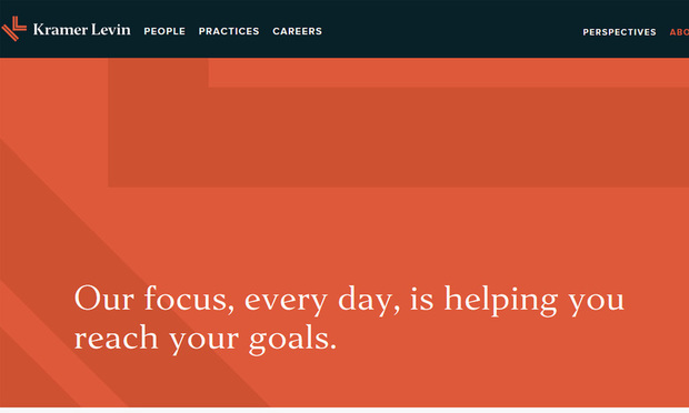 Screenshot of Kramer Levin’s new website.
Now, after 15 months of work, the firm has a new logo, a new color—orange—and a new website to show for it. Here are some thoughts on the process from Manton and Pearlman, and their advice to firms taking on the task of rebranding. Their answers have been edited for length and clarity.
How did this whole process get started?
Paul Pearlman: We’re about to turn 50 in 2018. It was time for us to redo our website. We are also about to start a major renovation of our offices and we felt it was a good time to take a look at our place in the marketplace, and our visual identity and materials.
Part of this also relates to the generational change that’s going on here as well as at many other law firms. Your brand and visual identity is certainly more important to the younger generation. All of those things came together at the same time.
Jennifer Manton: It was the perfect storm. From the pure tactical perspective, it’s really important not to just do a website without taking a look at your visual identity system. It can’t be a standalone. Instead of just going into the website and easing into the other things, I wanted to take the other approach.
What was that approach? What had to happen first?
JM: It was a lot of interviews conducted around the law firm. They were helping us articulate our strengths, where we thought our opportunities were in the market and where we had challenges. We did over 60 internal interviews. We also spoke with 15 clients.
[Brand consultancy] Clarity takes that work and they help us define it in terms of a position statement for the firm, brand characteristics, and they also developed for us something called tone controls, which we relied most heavily on in crafting the visual identity.
When we got to the point where Clarity said this is your brand strategy, it wasn’t a surprise … because it was defined and born out of what we believed.
How did the firm’s lawyers react to this?
PP: Everybody recognized that we needed to do a whole refresh. From that perspective, everybody was on board. What people didn’t appreciate at the time was the scope of the process … that was an educational process for all of us. We certainly hired the right people and we put together a brand identity committee early on, and I think we got people who were enthusiastic about the project. So we were able to build consensus quickly from the top down, but also from the bottom and the middle up.
How did the firm’s goals for its online presence affect rebranding decisions?
JM: We know that the most visual brand asset of any law firm today is the website. The difference in doing this project this time, even more so than when I had done it in 2013 at a different firm, is that the mobile experience and the tablet experience was a key driver.
What obstacles or challenges did you face along the way?
PP: When you have 100 partners or so, you have a lot of different points of view or opinions … different perspectives on how important your website is, how important different materials are. Trying to deal with all those different perspectives was a challenge, but I think it was one that was expected.
What was the biggest surprise you encountered when going through this process?
PP: A positive surprise was just how enthusiastically an overwhelming number of people embraced the exercise. [Before starting this process,] even just to get people under the existing website to provide content, to make changes to the existing website was like pulling teeth. But once we said we were doing a whole overhaul, people were on board.
JM: There was a real desire and a recognition by our folks that we needed to do this. That obviously helped us succeed.
How much did you look to the market and your competitors when making your own branding decisions?
JM: We had a comparable set of peer firms that we looked to. We also looked more broadly at the Am Law 200. In coming up with the logo and color, we looked at a color wheel and saw 146 of the Am Law 200 firms used blue as their primary color. [That included Kramer Levin, but their brand color is now orange.]
What other factors went into deciding the visual aspects of the firm’s brand?
JM: We had a scorecard we had to use when we were evaluating any of the work they put in front of us. We had four tone controls: clear, energetic, engaging and confident.
As CSA would present the color orange, for example, that was representative of something we felt was energetic. That kept us focused on making decisions not based on personal preferences. It really helped keep the group disciplined.
How do you deal with contradicting opinions on branding among partners and leadership?
JM: Something we did early on was, after the initial decision was made, we really just focused in on the core elements of brand identity and that was logo, color and font. We were able to take time off at the partner retreat and look at that. We also spent the summer discussing it with associates at the firm and staff. By the time we got to brand launch last week, there was already a familiarity.
What advice would you give to someone in your position whose firm is getting started with a rebrand process?
PP: Make sure the person in charge of the project knows what they’re doing and has the confidence of the partners.
JM: Make sure the firm is ready.
PP: That’s critical. Then start to build consensus as quickly as possible
JM: The process is more important than the output. Without the process, you’ll never get there.